En este artículo mostraré cómo iniciar los pasos con el lenguaje XAML en .NET MAUI.
Windows 11 Insider Preview Build 25201
En este pequeño artículo vamos a utilizar controles de Telerik para .NET MAUI. En un artículo anterior vimos cómo crear una aplicación .NET MAUI y aquí haremos otra basada en otra plantilla (Telerik).
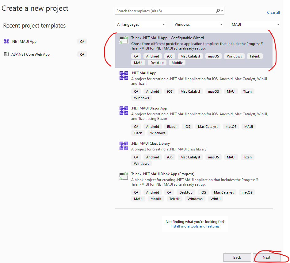
Telerik SideDrawer Link to heading
Este control (conocido como Menú Hamburguesa) se utiliza para hacer la navegación muy amigable debido a que el menú queda al costado de nuestro diseño y permite una visualización completa del mismo. En Windows 11 se refiere a NavigationView.
La definición del control, en lenguaje XAML, sería:
<ContentPage xmlns="http://schemas.microsoft.com/dotnet/2021/maui"
             xmlns:x="http://schemas.microsoft.com/winfx/2009/xaml"
             xmlns:telerik="http://schemas.telerik.com/2022/xaml/maui"
             x:Class="TelerikMauiApp1.MainPage">

    <ScrollView>
        <telerik:RadSideDrawer x:Name="drawer"
                       DrawerLength="200">
            <telerik:RadSideDrawer.MainContent>
                <Grid>
                    <Label Text="Main content on CMASDEV BLOG" />
                </Grid>
            </telerik:RadSideDrawer.MainContent>
            <telerik:RadSideDrawer.DrawerContent>
                <VerticalStackLayout Spacing="10"
                             Padding="10, 10, 0, 0">
                    <VerticalStackLayout.Resources>
                        <Style x:Key="DefaultButtonStyle" TargetType="Button">
                            <Setter Property="WidthRequest" Value="180" />
                            <Setter Property="HeightRequest" Value="40" />
                            <Setter Property="BackgroundColor" Value="#b1b1b1" />
                            <Setter Property="TextColor" Value="Black" />
                        </Style>
                    </VerticalStackLayout.Resources>

                    <Button Text="Mail"
                    Style="{StaticResource DefaultButtonStyle}" />
                    <Button Text="Calendar"
                    Style="{StaticResource DefaultButtonStyle}" />
                    <Button Text="People"
                    Style="{StaticResource DefaultButtonStyle}" />
                    <Button Text="Tasks"
                    Style="{StaticResource DefaultButtonStyle}" />
                </VerticalStackLayout>
            </telerik:RadSideDrawer.DrawerContent>
        </telerik:RadSideDrawer>
    </ScrollView>

</ContentPage>
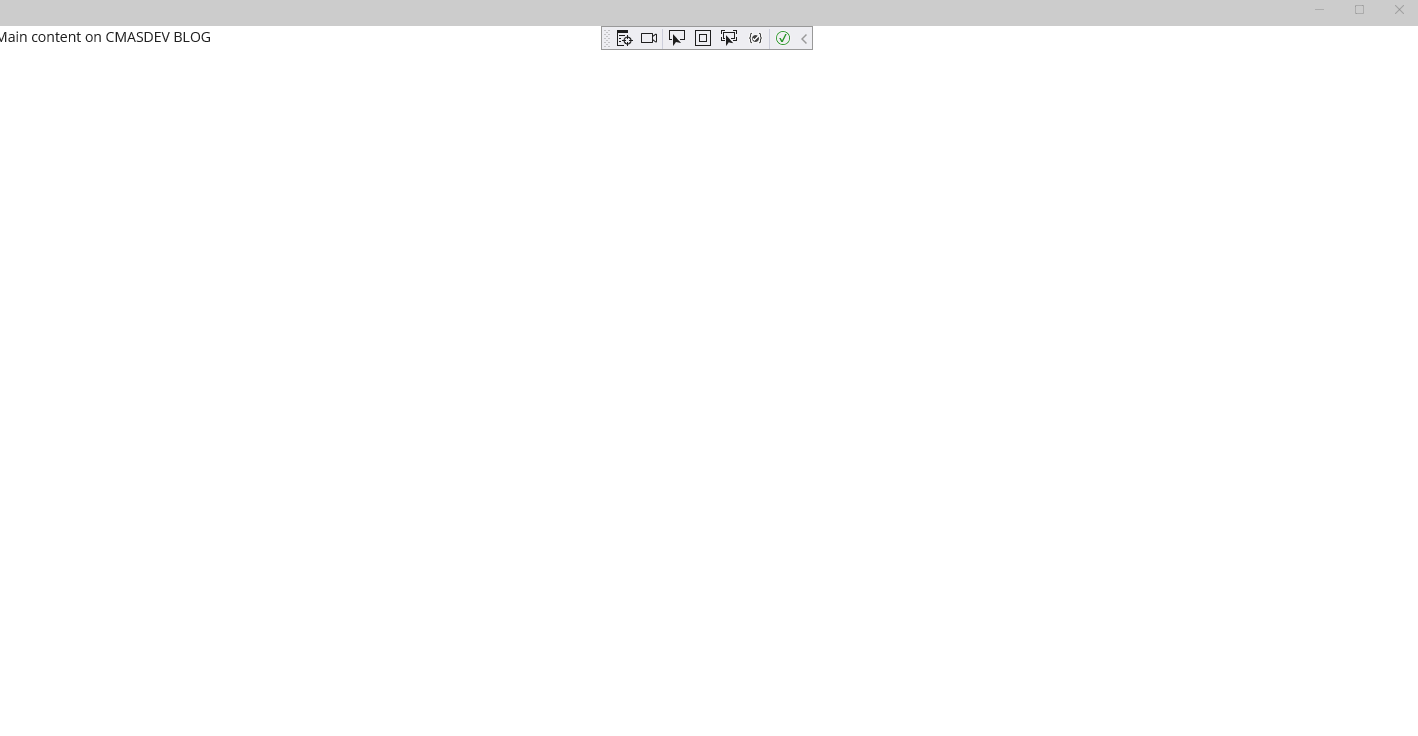
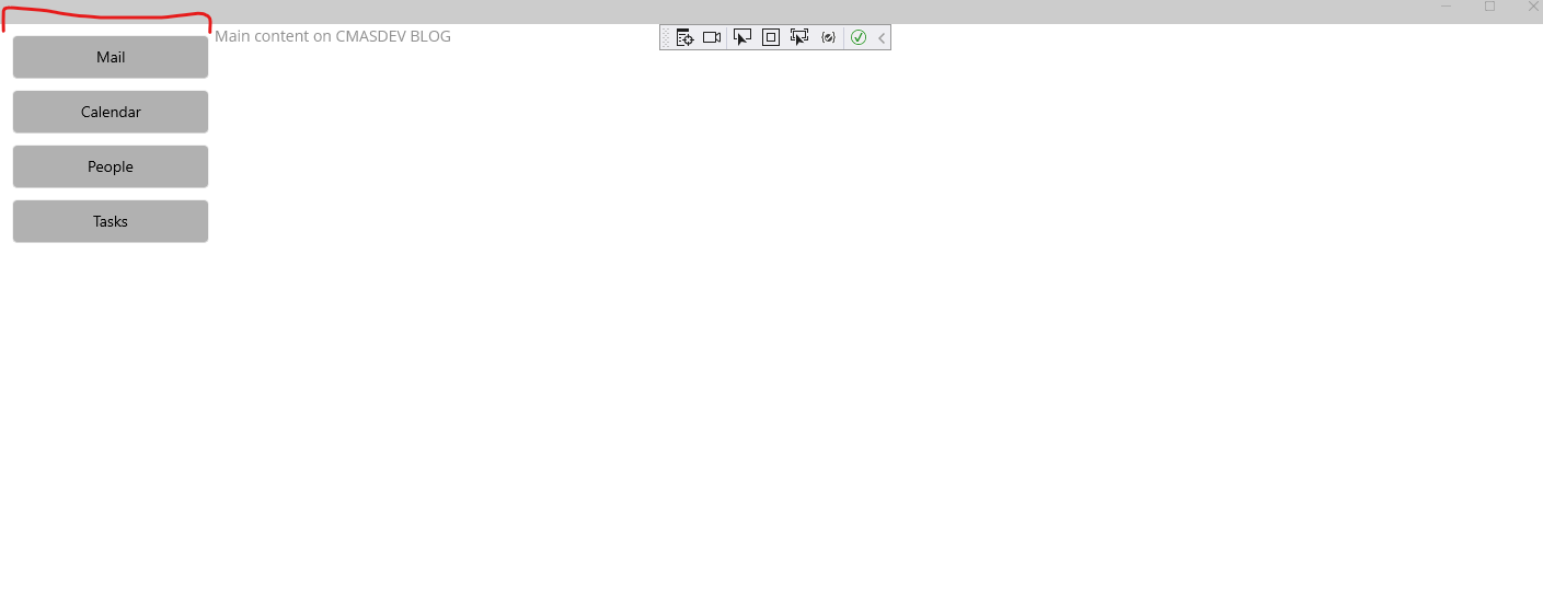
Con esta definición declarativa logramos que el control tenga todos los detalles necesarios para su funcionamiento.
Visualmente, el resultado del código XAML es:
Si realmente necesitas aprender XAML, la documentación de Microsft aquí está muy completa.
¡Espero resulte útil!